Itten Circle: Why It's Vital For Designing & Cross Stitching
- Polina Gorokhova

- Jun 15, 2020
- 3 min read
Updated: Apr 5, 2021
When you create a cross stitch pattern, you want it to be all perfect. The backstitch lines, the colours... Picking up the right colours may not always be a piece of cake. How do you make the design eye-catching? How to combine different colours on the object? How to make the shadows deeper and add volume? How to achieve the colour harmony? The answer practically always can be found. Let me introduce to you the Itten circle:

This strange thing with many hues is in fact a powerful instrument to work with colours. Knowing how to use it, one can create most impressive designs. In this article I will cover the most vital issues, but the field of colouring is much wider of course.
First of all, there are several basic proven ways to combine colours: 1) Complementary colours, which are opposite one another on the Itten circle. For example, the matching colour for yellow will be blue-violet. 2) Analogous colours. For example, blue, blue-green and green.
3) Triad colours. They form an isosceles triangle on the Itten circle. For example, light orange, blue-green and violet.

Now, OK, we know the basics. But how to use this new knoweldge in pattern designing? Let's imagine we want to draw a flower. Some simple flower, one colour for the stem and one colour for the petals. And the petals would be...red-violet. Yes, this color, please. Have a look at the Itten circle. Which colour is the complementary one for red-violet? It will be green, but not the green one next to blue. No, this is green with slightly yellow shades, right in the center of the green palette. And they will work together better than red-violet and some cold blue green! Have a look at the picture below. The first flower is drawn with complementary colours while two other not. (Please don't judge the flower itself strictly :) It was created quick-hand only to show the colours)

And what if we want three colours on our flower? You know the answer, do you?) Yes, we will add the third colour from the triad.
This is only the beginning. How else can we use the Itten circle? Analogous colours can help us in creating beautiful things, with deep shadows and highlighted areas! More than that, they can help us in creating the superb colour changing and also in creating the optical colour mixing. The optical colour mixing is the effect when your eye can't distinguish the difference between some colours strictly. For example, you use blue, blue-green and blue-violet for your picture or cross stitch pattern, but all together they look like blue. Why such difficulties, if they look 'just' blue? Adding more shades to your work helps to make it full of life, very interesting and eye-catching. Many artists use the rule of optical colour mixing in their works of art.

All the palettes from the picture above were created with the Itten circle, using analogous colours. These beautiful combinations look naturally and can be used to create truly effective and vivid designs! You can imagine a violet flower. In the shadows it will be blue-violet, practically deep blue. But where the sun touches the petals, they will be red-violet. And this is the colour harmony. Your eyes long for it.
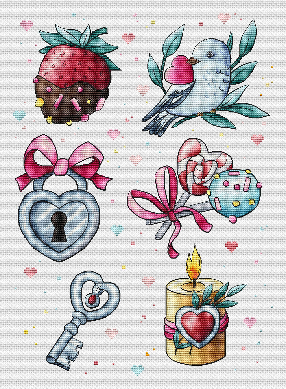
Here come some other examples of complementary or analogous colours in cross stitch patterns. For the dragon I used analogous colours (blue-greens and blues), and on the grass you can see the shades of green and yellow.

On the tulip petals you can also see the analogous colour palette, from yellow to vivid red color.

And the iris has both complementary and analogous colours, too:

Thank you very much for going on this small journey to the valley of the colour harmony with me!


Comments